Why Button Design Matters
Button design is critical for guiding users to take action. 70% of website visitors say they don’t convert due to poor UX, and a poorly designed button can be a big part of that. A well-designed button stands out, draws attention, and prompts users to engage, ultimately driving more conversions.Bad Button Design = Lost Engagement: A Misplaced or Unclear Button Can Reduce Click Rates by 20%
If your buttons are poorly designed, you may experience:- Low engagement: If buttons don’t stand out, users won’t know where to click.
- Higher bounce rates: Frustrated users may leave your site if they can’t quickly take action.
- Missed conversions: Confusing or unclear button text can lead to missed opportunities.
- Increase click-through rates: Clear, contrasting buttons grab attention and drive action.
- Improve user experience: Easy-to-click buttons on mobile and desktop lead to smoother navigation.
- Boost conversions: Compelling button copy paired with strategic placement encourages more users to convert.
Examples: How Button Design Improved Conversions
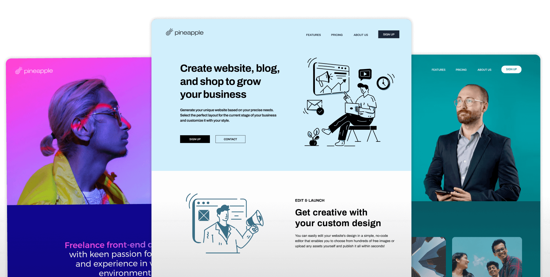
Pineapple Builder – Color Contrast
Pineapple Builder increased conversions by 12% simply by changing the button color to one that contrasted with the rest of the page, making it more visible.Basecamp – Strong CTA Copy
Basecamp optimized their button copy to focus on the user’s benefit (“Get Started Now”), resulting in a 34% increase in sign-ups.Airbnb – Mobile-Friendly Buttons
Airbnb made their buttons larger and easier to click on mobile, leading to a 20% improvement in overall mobile engagement.How to Improve Your Button Design
Follow these steps to optimize your button design for better conversions:2. Craft compelling copy – Avoid generic text like “Submit” or “Click Here.” Use action-oriented language that tells users what to do, like “Get Your Free Trial” or “Start Now.”
3. Make buttons large enough – Buttons should be big enough to be easily clickable, especially on mobile devices. A good rule of thumb is 44x44 pixels for mobile buttons.
4. Place buttons strategically – Position buttons in highly visible areas, like above the fold or at the end of a form, where users naturally look to take action.
5. Test different designs – A/B test button colors, sizes, and copy to see what drives the most clicks and conversions for your audience.
Do It Yourself
To optimize button design on your own:- Choose a contrasting color for your buttons to make them stand out.
- Write compelling CTA text that focuses on user benefits (e.g., “Download Your Guide”).
- Ensure buttons are responsive and easy to click on both mobile and desktop.
- A/B test designs to find the best combination of color, size, and copy that works for your site.
Done For You
With Pineapple Builder, button design is automatically optimized for you:- Automatic color selection: Pineapple Builder automatically picks the button color based on the background of your section, ensuring high visibility and contrast.
- Text contrast: Text color is automatically adjusted to achieve the best contrast ratio, improving readability and accessibility.
- Preconfigured theme variants: You can choose from theme variants for your sections, which not only update the design but also adjust button and text styles to maximize conversions.
Key Takeaways
Well-designed buttons are essential for driving conversions and improving user experience. By using contrasting colors, compelling copy, and ensuring the buttons are easy to click on any device, you can significantly boost engagement and conversions. Pineapple Builder makes this process effortless with automatic button design and preconfigured themes that take care of color contrast and style for optimal performance.FAQ
The Most Common Questions
How important is button design?
Button design significantly impacts user interaction, as it drives attention and guides actions.
What color should I use for buttons?
Choose colors that contrast with your background and fit within your brand color palette for better visibility.
How large should buttons be?
Buttons should be large enough to be easily clickable on both desktop and mobile devices.
Should I test different button designs?
Yes, A/B testing button styles can reveal which designs drive the most interactions.


100+ Website Tips Subscribe for Updates
Subscribe now for the latest tips on how to improve your website.