


Utilize Responsive Images for Faster and Flexible Websites
Optimizing images to be responsive is crucial for enhancing website performance and ensuring a seamless user experience across all devices. By implementing responsive images, you can reduce load times, save bandwidth, and increase user engagement, ultimately boosting your conversion rates.Slow Images Can Sabotage Your Conversions
- Increased Load Times: Images that are not optimized for different devices can significantly slow down your website. 53% of mobile site visits are abandoned if pages take longer than 3 seconds to load.
- High Bandwidth Usage: Serving oversized images wastes bandwidth, leading to higher costs and slower performance, especially for users on limited data plans.
- Poor User Experience: Images that do not adapt to various screen sizes can appear distorted or take too long to load, frustrating users and increasing bounce rates.
- Faster Load Times: Appropriately sized images load quicker, keeping users engaged.
- Cost Efficiency: Reduced bandwidth usage lowers hosting costs.
- Enhanced SEO: Faster websites are favored by search engines, improving your site’s visibility.
Examples: How Boost Your Sales by %15 with Responsive Images
Shopify - 12% Increase
After reducing image sizes and enabling lazy loading, Shopify improved load times, leading to a 12% increase in conversions.Airbnb - 15% Boost
Airbnb implemented responsive images, resulting in a 15% faster page load and a significant rise in user retention.Dropbox - 10% Growth
Dropbox optimized their images for various devices, enhancing user experience and achieving a 10% growth in sign-ups.Etsy - 8% Higher Engagement
Etsy’s use of responsive images led to an 8% increase in user engagement by ensuring images loaded swiftly on all devices.Medium - 20% Reduction in Bounce Rate
Medium optimized image delivery, resulting in a 20% reduction in bounce rate as users experienced faster loading times.How to Utilize Responsive Images
Do It Yourself
1. Use HTMLsrcset and sizes Attributes:- Implement the
srcset attribute to define multiple image sources for different screen sizes.- Use the
sizes attribute to specify how much space the image will take on various devices.<br/><div><p>html</p><p><code id="code-lang-html"><span><<span>img</span> <span>src</span>=<span>"image-small.jpg"</span><br/> <span>srcset</span>=<span>"image-small.jpg 600w, image-medium.jpg 1200w, image-large.jpg 1800w"</span><br/> <span>sizes</span>=<span>"(max-width: 600px) 600px, (max-width: 1200px) 1200px, 1800px"</span><br/> <span>alt</span>=<span>"Responsive Image"</span>></span><br/></code></p></div><br/>2. Leverage CSS Techniques:
- Utilize CSS media queries to serve different image versions based on device characteristics.
<br/><div><p>css</p><p><code id="code-lang-css"><span>.responsive-image</span> {<br/><span>background-image</span>: <span>url</span>(<span>'image-small.jpg'</span>);<br/>}<br/><br/><span>@media</span> (<span>min-width</span>: <span>600px</span>) {<br/><span>.responsive-image</span> {<br/><span>background-image</span>: <span>url</span>(<span>'image-medium.jpg'</span>);<br/>}<br/>}<br/><br/><span>@media</span> (<span>min-width</span>: <span>1200px</span>) {<br/><span>.responsive-image</span> {<br/><span>background-image</span>: <span>url</span>(<span>'image-large.jpg'</span>);<br/>}<br/>}<br/></code></p></div><br/>3. Optimize Images with Tools:
- Use tools like ImageMagick, Squoosh, or responsive image plugins for CMS platforms to create optimized image versions.
Done For You
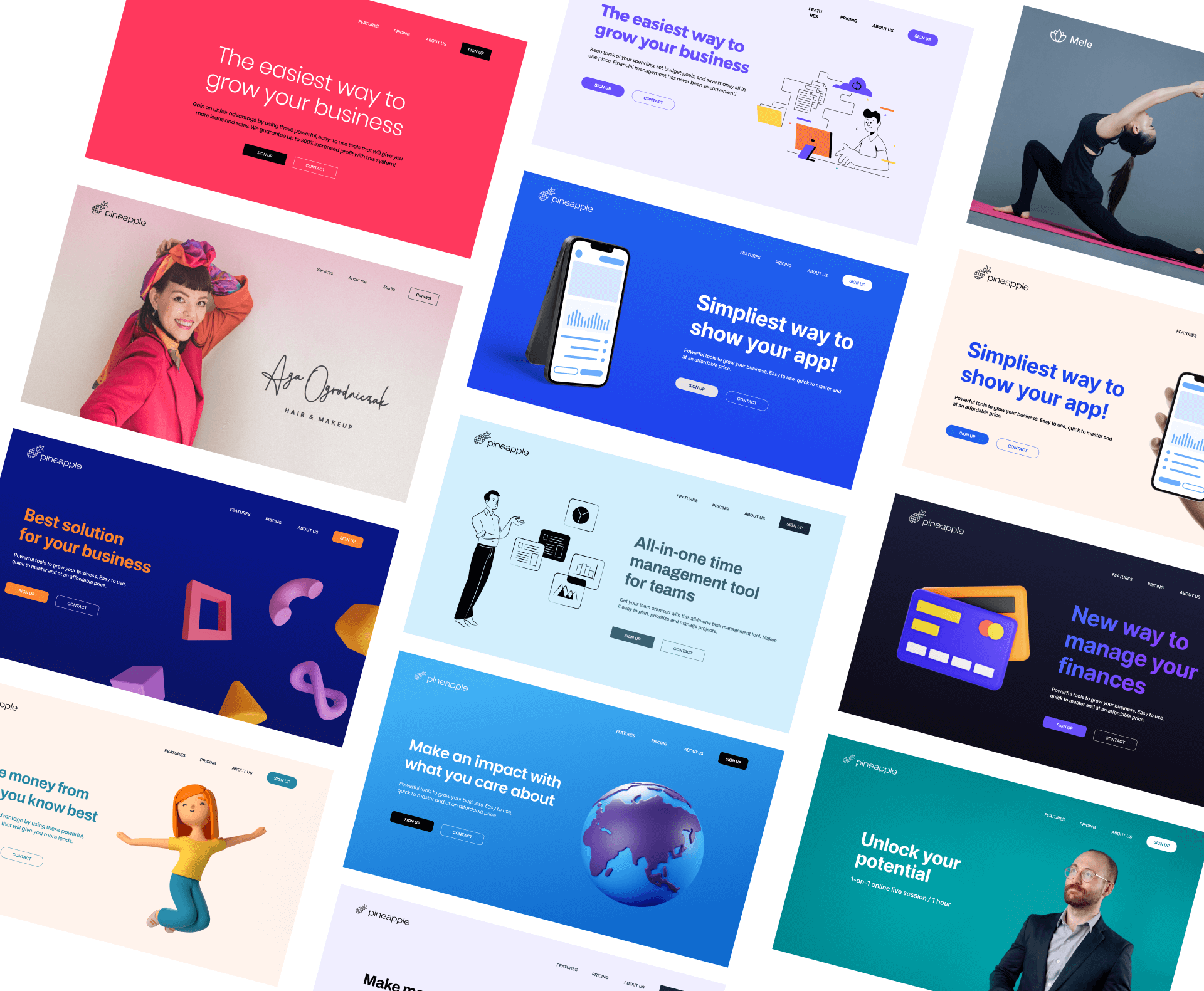
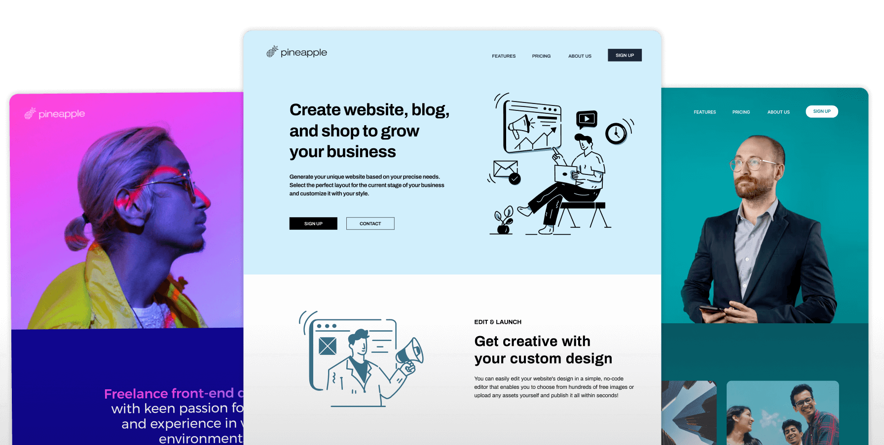
Modern website builders like Pineapple Builder automate the optimization of all your images upon upload. Pineapple Builder not only optimizes images for different locations but also adjusts them for various screen sizes in real-time using their fast CDN network. This process eliminates the need for manual optimization and technical handling, ensuring your website remains fast and responsive without the hassle. Plans start from $12/mo.Key Takeaways
- Implement Responsive Images to significantly boost website speed and enhance user experience across all devices.
- Reduce bounce rates and increase conversions by ensuring your images load quickly and look great on any screen.
- Leverage automated tools like Pineapple Builder to handle image optimization effortlessly, allowing you to focus on growing your business.
FAQ
The Most Common Questions
What are responsive images?
Images that automatically adjust their size and resolution based on the user’s device and screen size.
How do responsive images improve performance?
They reduce load times by serving appropriately sized images, decreasing bandwidth usage and speeding up page loads.
How to implement responsive images?
Use HTML’s srcset and sizes attributes or CSS techniques to serve different image versions based on device.
What tools can help create responsive images?
Tools like ImageMagick, Squoosh, and responsive image plugins for CMS platforms can assist in creating responsive images.


100+ Website Tips Subscribe for Updates
Subscribe now for the latest tips on how to improve your website.

