Contact form
Collect a visitor’s email and the details you need to respond to an enquiry.
Code name: ContactForm · Category: Forms
Registered in the live renderer. Website context and the limitations below still apply.
When to use it
Use a contact form for service enquiries or quote requests. Ask only for the information needed to respond, and explain the next step after submission.
In the editor
- Choose your fields and labels.
- Set which fields are required and write the success message.
- Test submission and receipt separately from checking the form’s appearance.
Example
This example uses illustrative content. Media placeholders must be replaced with your own assets; data-backed blocks need the normal website context.
<ContactForm buttonText="Send enquiry" successText="Thanks. We will be in touch." fields={[
  { id: "email", label: "Your email", type: "email", required: true },
  { id: "message", label: "How can we help?", type: "textarea", required: true }
]} />
Behaviour and limitations
- Use 1–8 fields and exactly one required email field. Supported types are text, email, tel, textarea, select and checkbox.
- Each field needs a stable id, label and type. Select fields also need options; the renderer caps these at eight.
- Change the submit label with buttonText. Do not insert a child Button.
- Legacy name and message labels are supported for older forms; use fields for a new configuration.
Property reference
Types below describe the editor controls and known choices, not every value accepted by the renderer. A renderer default is extracted from its parameter; an editor-only default does not prove the runtime default. “Not declared here” does not mean required. Preserve omitted values unless the requested edit needs them.
| Property | Editor value type | Default evidence | Guidance |
|---|---|---|---|
fields | array | [{"id":"name","label":"Name","type":"text","required":true},{"id":"email","label":"Email","type":"email","required":true},{"id":"message","label":"Message","type":"textarea","required":true}] (editor only) | Form Fields. See the usage notes for this block. |
buttonText | string | "Contact" (renderer) | Button Text. See the usage notes for this block. |
successText | string | "Thank you. We will contact you soon." (renderer) | Success Text. See the usage notes for this block. |
name (legacy) | string | "Name" (renderer) | Name (legacy). See the usage notes for this block. |
message (legacy) | string | "Message" (renderer) | Message (legacy). See the usage notes for this block. |
colorVariant | "primary", "secondary" | "primary" (renderer) | Color Variant. See the usage notes for this block. |
borderColor | "inherit", "black", "white", "primary", "secondary" | "inherit" (renderer) | Border Color. See the usage notes for this block. |
backgroundColor | string | Not declared here | Background colour. Theme-derived appearance can still depend on the surrounding section. |
containerDirection | See guidance | Not declared here | containerDirection. See the usage notes for this block. |
align | "left", "center", "right" | "center" (renderer) | Align. See the usage notes for this block. |
width | number | 500 (renderer) | Width. See the usage notes for this block. |
spacing | object | Not declared here | An object of spacing settings. Preserve existing responsive values when changing a single setting. |
animationType | "none", "fade-up", "fade-down", "fade-left", "fade-right", "flip-up", "flip-down", "flip-left", "flip-right", "zoom-in", "zoom-left", "zoom-right" | "" (renderer) | Entrance animation setting. Use a supported editor value; preserve it for unrelated edits. |
screenList | string | "" (renderer) | Comma-separated device names to hide on: mobile, tablet, desktop. An empty string hides on none. |
Legacy compatibility
name, message are retained for compatibility. Preserve existing values unless the requested change requires migration; do not choose them for new content without checking the notes above.
Related blocks
Add Contact Form
First, navigate to the Editor and select the area where you want to add the form.

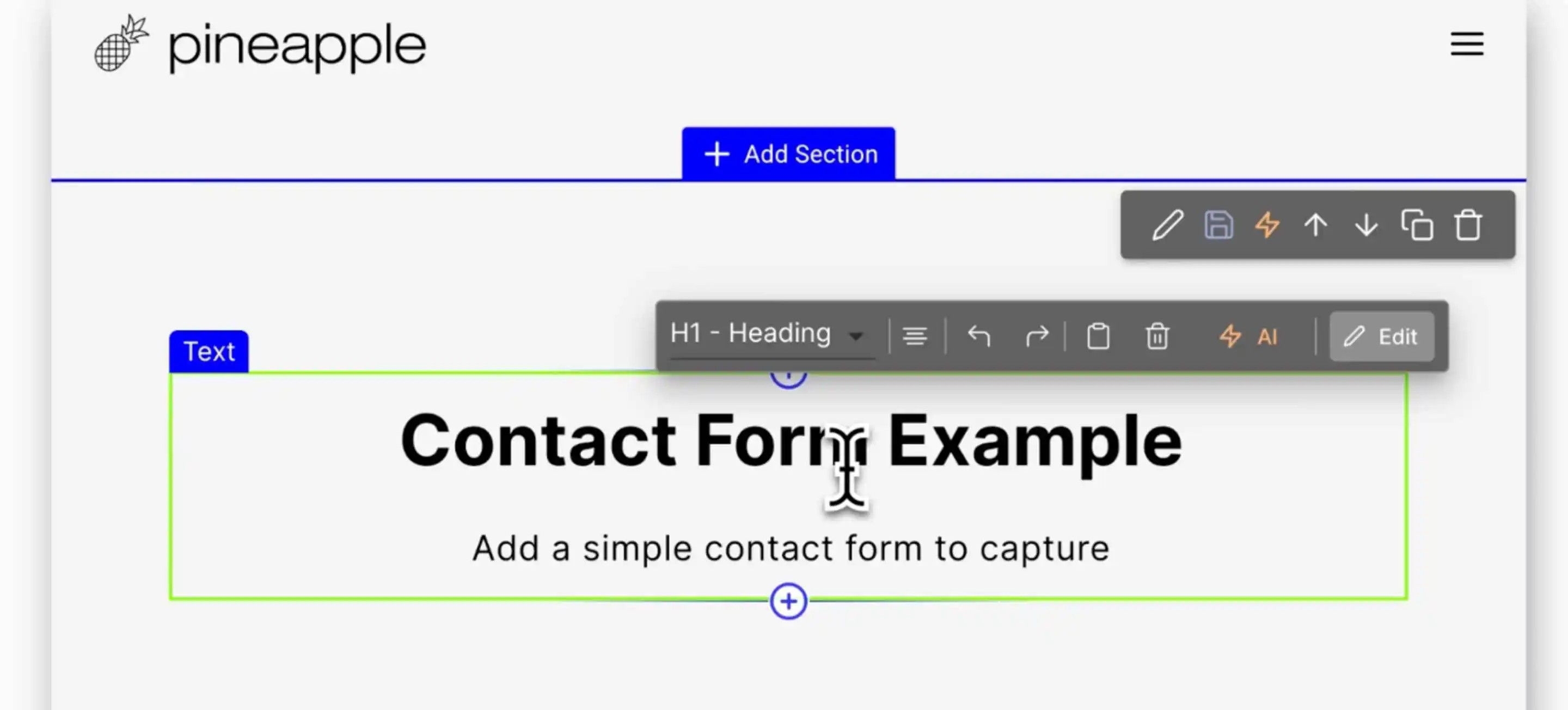
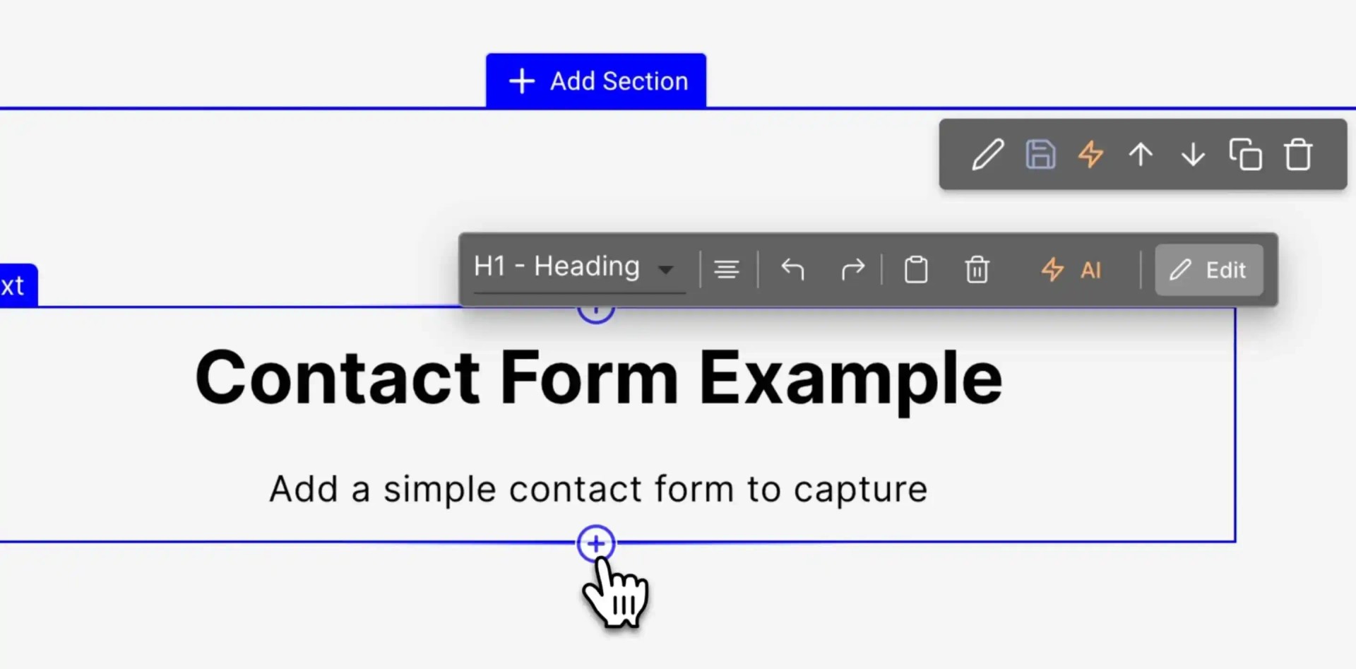
Click the blue + button to insert a new element.

In the menu, navigate to the Forms section. Here, you will find various templates such as:

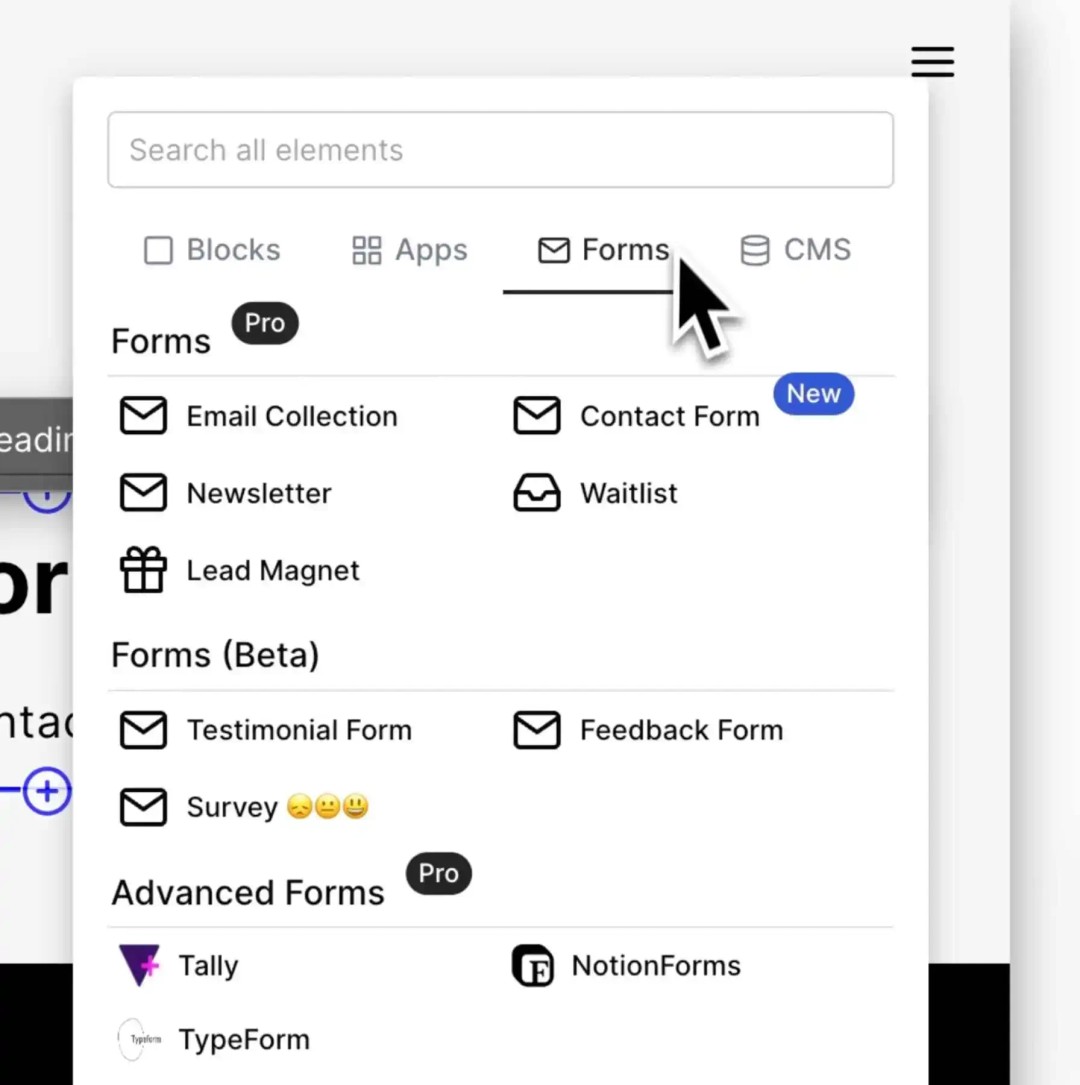
Waitlists
Newsletters
Contact forms
For this tutorial, select the Contact Form template.

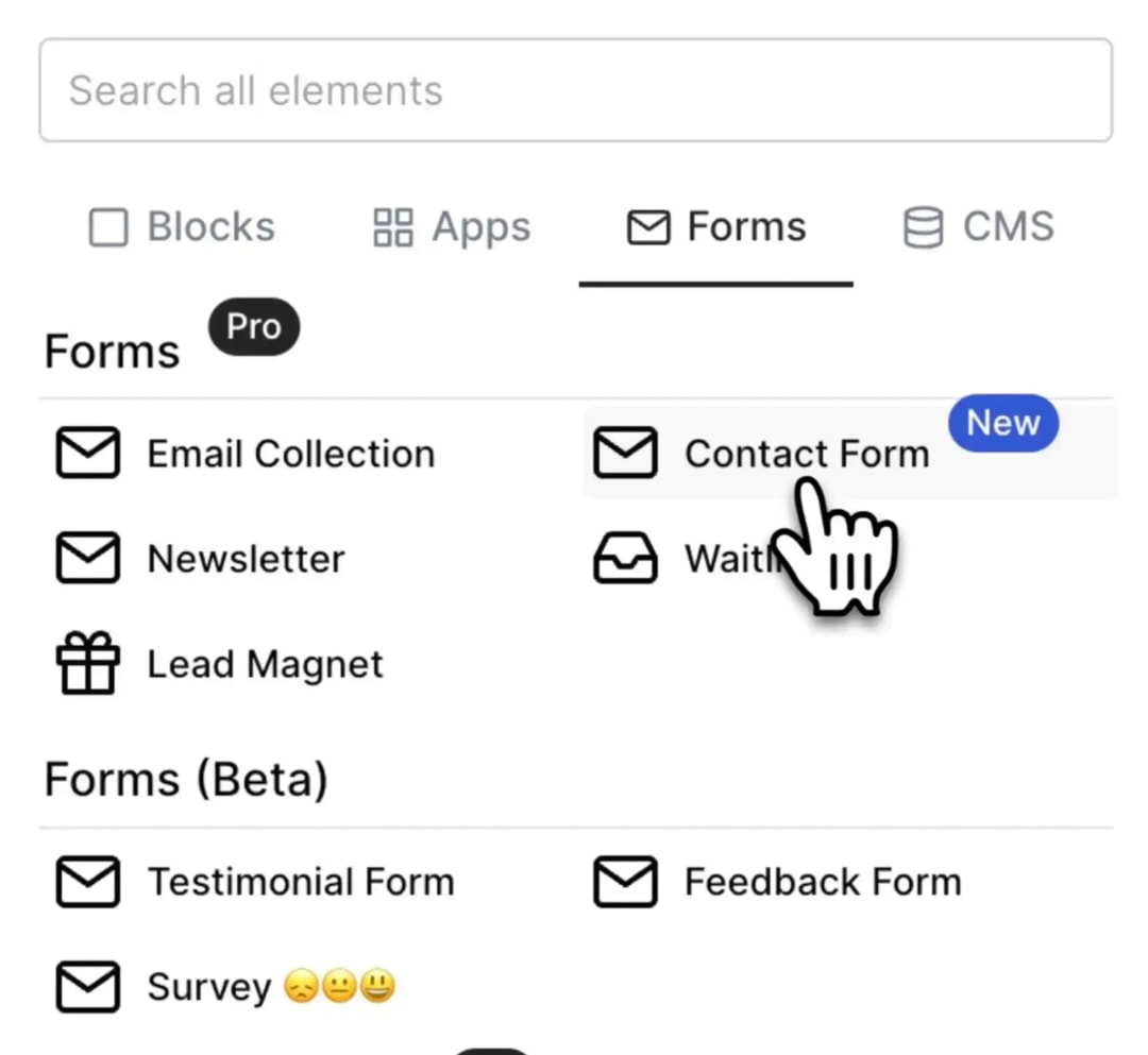
This will add a simple form to your page, capturing the customer’s name, email, and message. To customize the form:
Click on the form and hit the Edit button.
In the right panel, adjust the settings:
Change field names.
Edit placeholder text.
Modify the success message displayed after form submission.
Configure the form’s style, including padding and layout, to match your website's design.
After making your adjustments:
Save your changes by clicking the Save Draft button if you’re not ready to publish.
Preview the draft version to ensure everything works correctly.

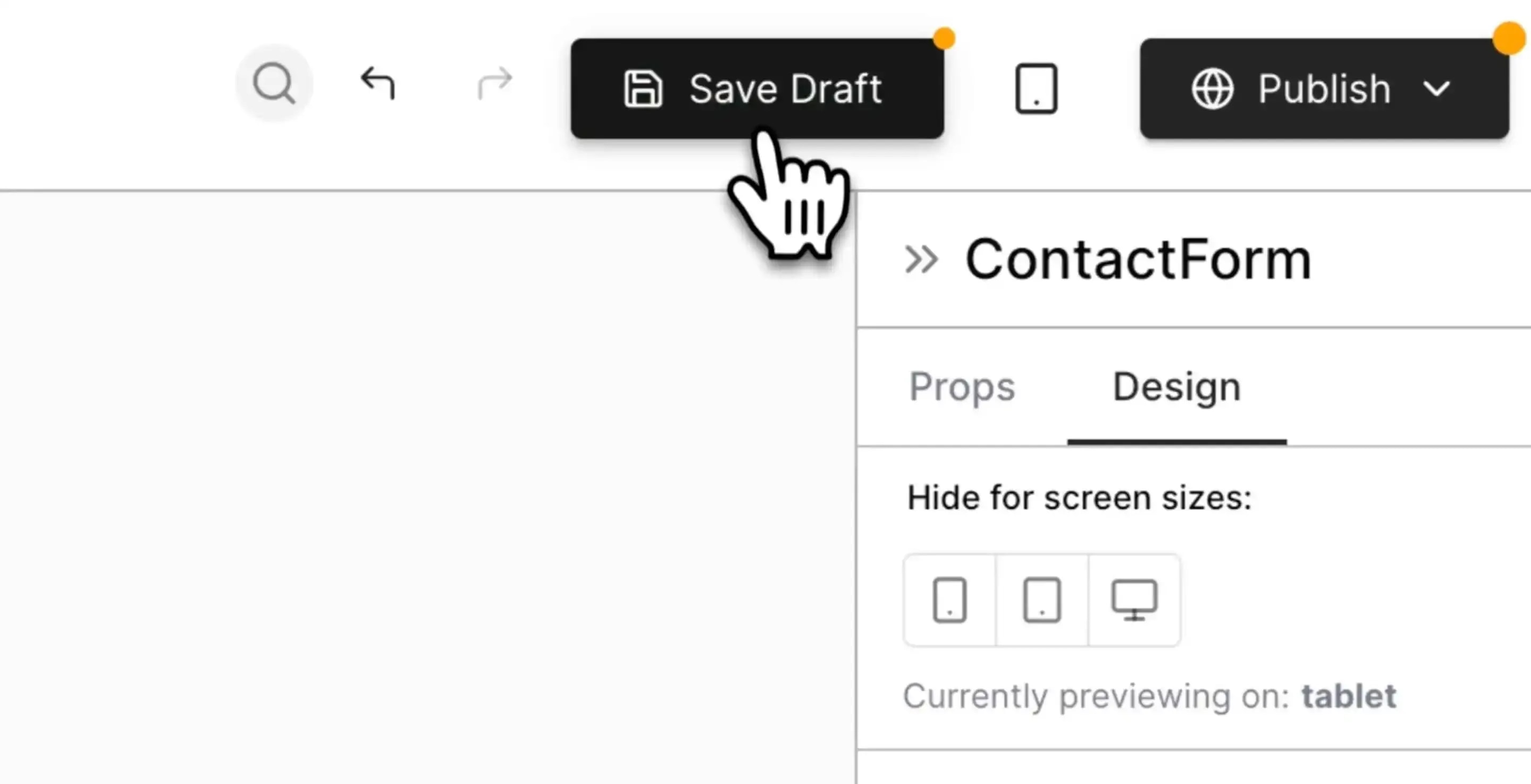
When you’re satisfied with the form:
Publish your page by clicking the Publish Page button.
Note that it may take a few moments for the page to become available.
Test the form by opening up the updated page in a new window and submitting an entry.
Upon form submission:
Both you and your customer will receive a confirmation email.
You can respond directly to their inquiry.
With this new contact form, you can start capturing customer inquiries quickly and efficiently.